Community Portal
Branding, Art Direction
MGP, a GIS consonsortium that partners with communities and provides their suite of software to empower them, was about to launch a new platform and needed a brand that felt trustworthy and simple

Main Lockup
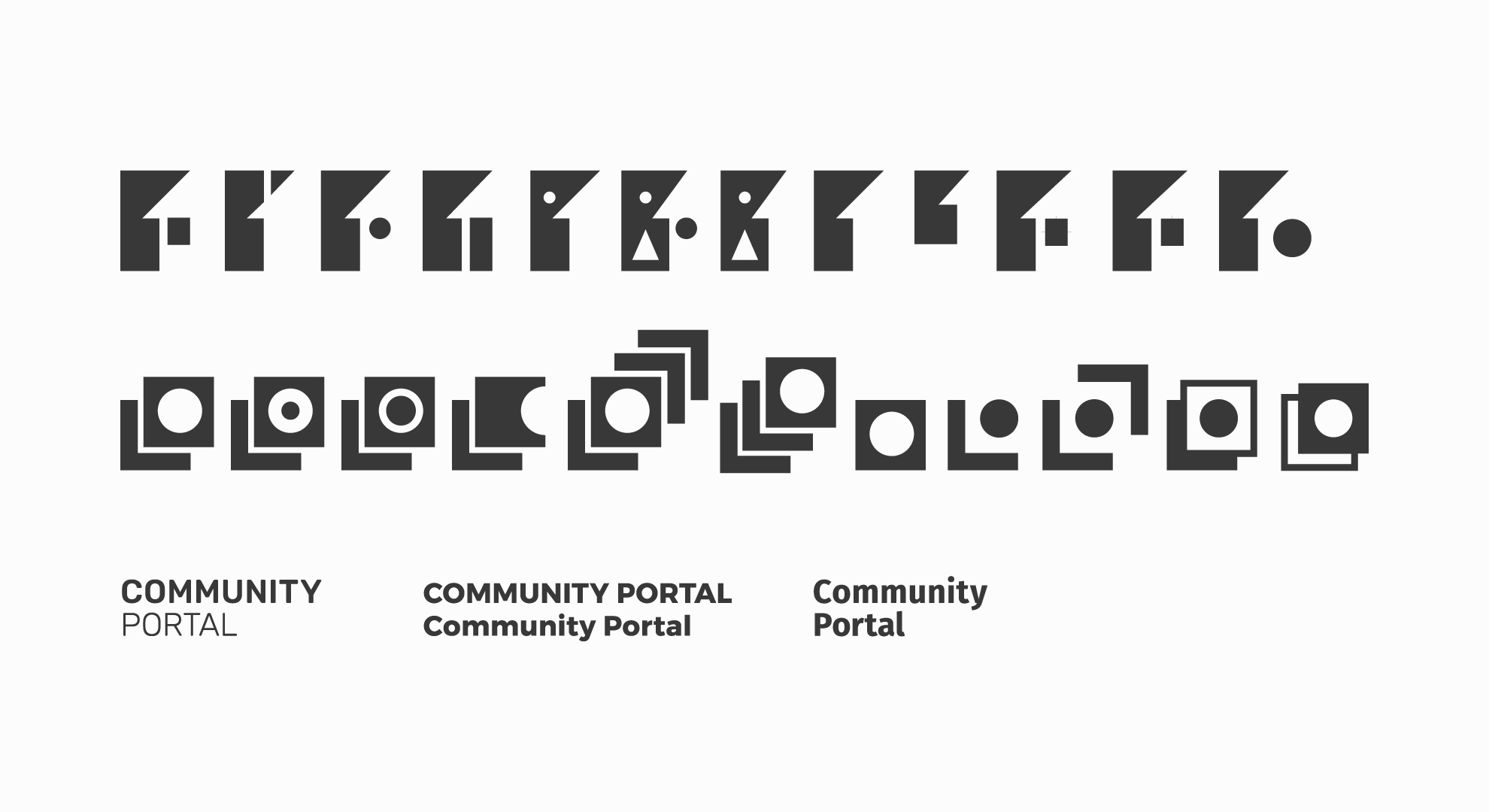
Process Sketches
 Final Sketches
PROCESS:
Their newest web tool, Community Portal, provides people within a community or township with the ability to search through a database, relating to information from zoning info to property taxes. This information was organized in a group of layers. My lead and I used this aspect of layers to incorporate it into the logo and branding vernacular.
 Color Logomark 1
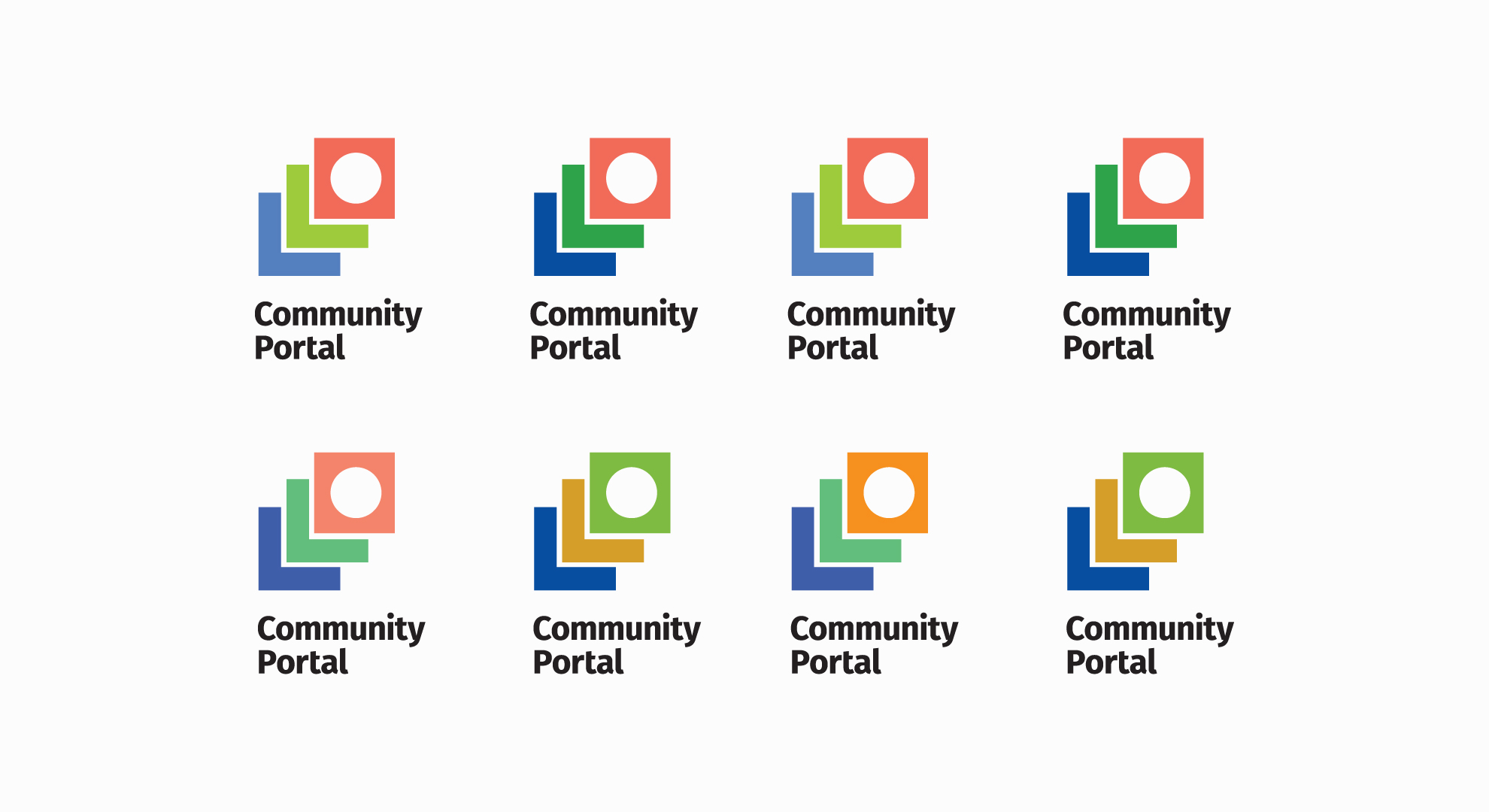 Color Logomark 2
SOLUTION:
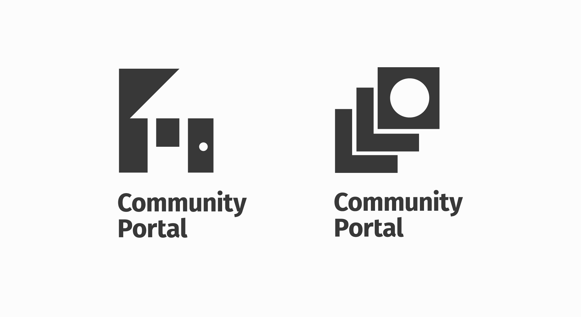
I created a series of identifiable marks that related to community, but during our collaboration with MGP, I refined the mark to a more simplified form; A direction that instilled confidence in MGP’s stake holders. A circle on the forthmost square, meant to signify a portal, provides easy access for MGP's users, through all the layers of information they browse about their community.
Designer: Christopher Santoso
MGP: Chad Krater, Matt Huser
Design Lead: Michelle Sus
UI Design: Amenrey Nln
Designer: Christopher Santoso
MGP: Chad Krater, Matt Huser
Design Lead: Michelle Sus
UI Design: Amenrey Nln


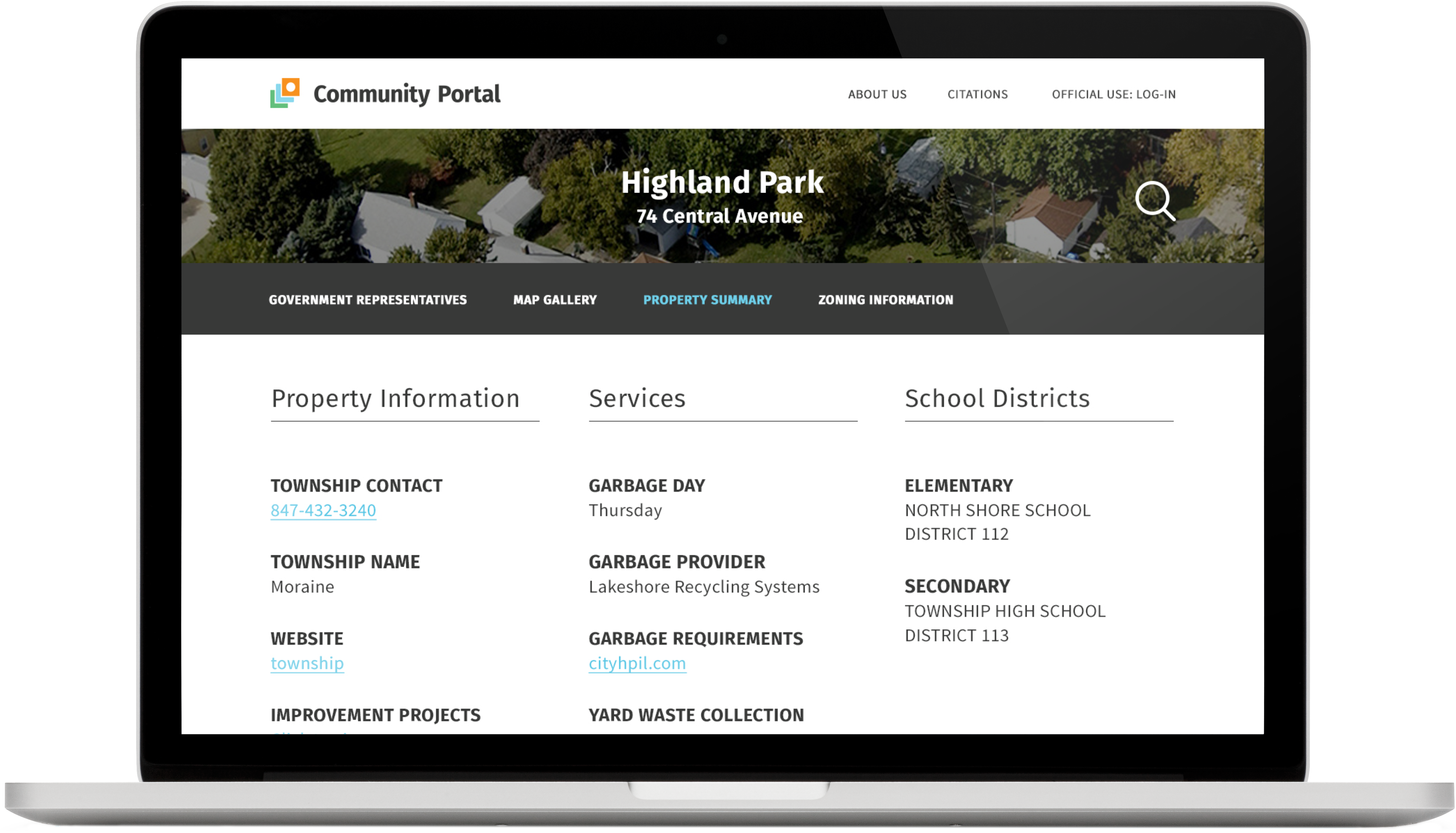 Community Portal Platform
Airport Banner Ad

Sell Sheets